Wednesday 1 March 2017

Pyrosequencing

Sanger sequencing was used in the first generation of DNA sequencers. Despite miniaturisation and a certain amount of automation, it was still relatively low throughput and laborious. Pyrosequencing was the first second generation sequencing method, providing researchers with a much higher throughput. With pyrosequencing there wasn't any need for messing around with clone libraries, you could just stick your sample in, amplify it up and sequence it. In papers you might see it referred to as 454 pyrosequencing or Roche pyrosequencing, they are essentially the same method but using different machines from different companies.

Putting the Pyro is Pyrosequencing

Like Sanger sequencing, pyrosequencing uses sequencing by synthesis. Rather than inferring the sequence from electrophoresis, pyrosequencing uses biochemistry and the emission of light.

The pyro in pyrosequencing comes from pyrophosphate. Essentially, pyrosequencing measures the amount of pyrophosphate in a reaction well or vessel. Why pyrophosphate? Well, there are three chemical reactions behind pyrosequencing:

1. The addition of a nucleotide to a DNA strand catalysed by the enzyme DNA polymerase which produces a pyrophosphate as a byproduct. Pyrophosphate is also called diphosphate (two phosphates stuck together) and often abbreviated to PPi.

This diagram shows the nucleotides wit their phosphate tails. One phosphate is used to bind to the previous nucleotide, releasing the other two as pyrophosphate (PPi)
  DNA_polymerase.svg: Madprime derivative work: Chandres, DNA polymerase-FR, Cropped and text removed, CC BY-SA 3.0

2. The addition of this PPi to AMP (adenosine monophosphate) to make ATP.

3. The conversion of luciferin to oxylucifern. This process consumes one molecule of ATP and gives out one photon of light.
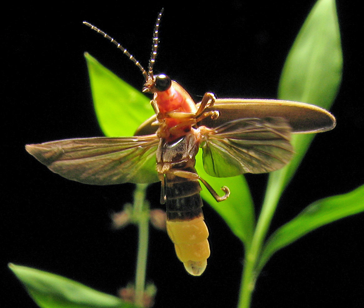
The luciferase used to produce the light signal is the same enzyme found in fireflies.
  art farmer from Evansville Indiana, USA, Photinus pyralis Firefly 4, CC BY-SA 2.0

So we can go from the PPi produced by adding a nucleotide to a strand of DNA, to the emission of a light signal proportional to the amount of PPi initially present (1 PPi --> 1 ATP --> 1 photon released). If a nucleotide has been added then a light signal is produced. So far so good... but how do they actually make this into something practical?

Emulsion PCR

Ordinary PCR is not enough for pyrosequencing. Ordinary PCR is fairly inelegant, you mix everything together in a small tube, put it in a PCR machine to produce a big mix of everything together. This is fine for a homogenous sample (sequencing one gene from the same person, for example). However, in microbiomics there's a mind-bogglingly heterogeneous sample with hundreds of different 16S rRNA gene sequences.

In the past scientists came up with ways to separate and then sequence the DNA (see clone libraries and DGGE). This isn't good enough for pyrosequencing. Pyrosequencing is a different beast. It allows you to simultaneously sequence a million DNA strands with different sequences, at the same time, in real-time. It's massive parallel sequencing. But first, you need to separate out the strands of DNA, which is where emulsion PCR comes in.

There are loads of good resources (like this one or this video) that describe the process of emulsion PCR (ePCR) if you want detail, however the basics are thus:

1. Each strand of DNA in a sample is attached to a tiny microbead in an oil-base which also contains everything you need for a regular PCR (primers, buffers, dNTPs and DNA polymerase).

2. The oil is then emulsified in water to form tiny droplets such that each droplet of oil contains one bead along with all of the stuff needed to amplify the DNA on the bead. Each droplet can be considered as a mini reaction vessel.

3. Run the reaction through cycles of denaturation, annealing and elongation as for a regular PCR.

4. What you end up with at the end is billions of microbeads coated with copies of whichever bit of DNA original attached to them.

Leveque Theau, EmPCRwiki, Text changed, CC BY-SA 3.0

I can't tell you what wizardry is employed to make sure that one piece of DNA binds to one bead which is them subsequently placed inside one droplet of oil in a reaction vessel. But it seems to work.

Sequencing the DNA Strands

Now that we've amplified, we can sequence the DNA attached to the tiny, tiny beads. Pyrosequencing takes place on a plate with lots and lots of tiny, tiny wells big enough to accommodate just one of our tiny, tiny beads. The beads are washed over the plate so each one sits inside a well. Everything needed for DNA synthesis is added to the well (except the dNTPs), as well as the enzymes and substrates to detect the PPi and emit a light signal.

In pyrosequencing there's a lot of repetitive washing. Let's have a look at what happens:

1. A dNTP (GTP) is washed over the plate into all of the wells.

2. DNA synthesis takes place, so if the next bases on the DNA strand in the well are Gs, they will be added to the DNA strand. Note that if the sequence is ATCAGGGGGGGAT, all of those 7 Gs will be added at once.

3. Conditions in the reaction well are changed so that the enzymes for the detection of PPi can do their work. If no GTP was added to the strand, there will be no PPi and therefore no light signal. Remember that the light signal is proportional to the amount of PPi, so if two Gs were added then the light signal will be twice as strong as the signal when one G is added. We can use a computer to interpret the light signals  and decide how many Gs have been added.

4. The spare GTP is then either washed out or inactivated.

5. The next nucleotide is washed over the plate and the process repeated sequentially for each nucleotide until all of the DNA has been sequenced.

Just to illustrate this, let's imagine that we have a plate with 4 wells, each with the following 10 base pair DNA sequences in them:

1. TGCCCCTTTC
2. GACCCAAAAT
3. GGGCTTTTAA
4. TTACCCCCTA

We can watch them being sequenced in the animation below:
Except that this doesn't just happen with 4 sequences over 10 base pairs. It's happening with up to 1,000,000 sequences over 400-500 base pairs. A computer analyses the light signals emitted from each well and decides how many nucleotides were added depending on the intensity of the light (with reference to prior calibration).

However, pyrosequencing is not without its flaws, but we can look at those in another post.


Thursday 23 February 2017

Constructing UPGMA Trees from DGGE Profiles


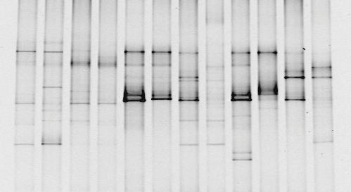
You've taken your sample, extracted the DNA, amplified the 16S rDNA in a PCR machine, run a DGGE gel and you end up with something like the picture below.

Bioguz at English Wikipedia, 16S PCR DGGE, CC BY-SA 3.0
You can see that in some lanes there are more bands than others, some bands are darker than others.. it's a start, but it's not like you can publish that as a brilliant discovery. It's time to do some analysis! As we discussed earlier, analysing the "darkness" of the bands to quantify how much DNA is there isn't a reliable analysis. The DGGE profile is essentially a fingerprint of the microbial community, so we have to rely on comparing different fingerprints and deciding how different they are.

We can compare fingerprints objectively and decide that "Column A looks different to B, it's got 3 bands in different places. Also, it looks more similar to B than it does to C", but that's about it.

Quantifying the Qualitative
What we really need for convincing results is to quantify the differences. The first step is to change our DGGE profile into a matrix. Each column is a sample, and each row is where a band appears in at least one of the columns. If a band is present we assign the value 1 and if not it gets a 0.

Converting a DGGE profile to a Binary Matrix. 
Now that we've assigned numbers to everything, we can get a quantitative idea of "distance" between different samples. To do this, we can either use a Jaccard index or Dice's coefficient. I'm going to focus on the Jaccard index. The formula is:

J(A,B) = |A∩B| ÷ |A∪B|

If you love maths, feel free to read about ∩ and ∪ here. The plain English translation is:


Percentage similarity = (|Number of rows where both columns are 1| ÷ |Number of rows where at least one of the columns is 1|) x 100
If we compare A and B from the profile above, there are 4 different rows which have bands in both A and B and there are 6 different rows which have bands in either A or B. So our percentage similarity is:
(4 ÷ 6) x 100 = 66.67
A and B are 66.67% similar. If we compare every sample with every other, we can build a similarity matrix. The similarity matrix for the profile above is:


A B C D E

A 100 -- -- -- --

B 66.67 100 -- -- --

C 42.86 25.00 100 -- --

D 16.67 33.33 14.29 100 --

E 25.00 11.11 66.67 33.33 100
This similarity matrix is a way of quantifying how different each of the samples is to each of the others. We can see quite easily that B and E are the most different and that C and E / A and B are the most similar samples. The rest of the data gets lost in the table. We want to present it in a way that's going to be easy for someone to look at and instantly see the relationships between different samples.

UPGMA Trees
Now that we've got a similairty matrix, we can build a UPGMA tree.
The first step is to identify which of our samples are most similar. A and B have a similarity of 66.67%, and so do C and E. We can plot this on a graph as shown below: 

The vertical lines are drawn at 66.6%. Now that AB and CE are joined together, we need to make a new similarity matrix to reflect this, starting with AB. We do this by averaging the similarities of A and B to all the other points as per the original similarity matrix. For example, in the original matrix A is 42.86% similar to C and B is 25% similar to C. Therefore the similarity between AB and C is (42.86 + 25)/2 or 33.93%. 


AB C D E

AB 100 -- -- --

C 33.93 100 -- --

D 25 14.29 100 --

E 18.06 66.67 33.33 100
Now that we've calculated the similarity between AB and the other samples, we can do the same for CE.


AB CE D


AB 100 -- --


CE 26 100 --


D 25 23.81 100
With our new similarity matrix, we look to see which points out of AB, CE and D are the closest together. AB and CE come out on top with 26% similarity. We can plot this on the graph:

Now AB and CE are joined together, so we need to make another similarity matrix to reflect this. Again, we'll need to re-calculate the similarity of ABCE to D by averaging the similarities of AB to D and CE to D which would be (25 + 23.81)/2.


ABCE D


ABCE 100 --


D 24.405 100


We can plot out final lines on the graph, joining ABCE and D at 24.4% similarity to produce the finished UPGMA tree.
This gives us a visually easy way of interpreting the data. Straight away we can group our 5 samples into 3 families which are roughly equally different from each other: AB, CE and D.
Is band intensity a measure of bacterial abundance?
Yes and no, but probably more no than yes. It's possible to analyse the intensity of bands in a DGGE gel to get a semi-quantitative idea of the abundance of bacteria from the sample. This requires imaging software which compares the intensity of each band to the total intensity in the lane (the sum of all the intensities of all the bands in the lane). 
What you're getting there is relative abundance so you can't conclude:
"Band X has an intensity value of 3, therefore there must have been 2.0x10⁶ Pasturella multocida in the sample"
but rather:

"Band X contributes 50% of the total band intensity, so roughly 50% of the bacteria in this sample contributed to Band X."
Of course, the waters are further muddied by the inconveniences that contribute to PCR biases like some bacteria having more than one copy of the 16S rRNA gene which may or may not all have the same sequence.
And then there's even more mud added when you consider some of the problems with DGGE like gel to gel variation. So at the end rather than a crystalline answer you've got something that looks decidedly murky.
In short:
Yes, you can use DGGE as a quantitative method BUT it's only semi-quantitative and why would you want to when you've got Next Generation Sequencing or quantitative PCR which are way better?
Some studies will list a Shannon index (discussed at the bottom of this blog). This analysis will be based on the intensity of the bands, since the Shannon index cannot work with the binary data that we used to draw a UPGMA tree. This is a valid analysis if you're comparing samples within your study, since all samples were analysed on the same gel and using the same software. However, remember it's not an absolute value so it can't be compared across studies, especially if it was calculated from a DGGE gel.

Thursday 2 February 2017

Denaturing and Temperature Gradient Gel Electrophoresis

Denaturing and temperature gradient gel electrophoresis (DGGE and TGGE) are methods of generating fingerprints of microbial communities. DGGE was first described by in 1979⁠, but wasn’t applied to profiling microbial communities until 1993⁠.

How does DGGE work?

The technique takes advantage of the different melting domains of double stranded DNA based on sequence and that a partially melted DNA molecule will stop moving through an agarose gel allowing for separation of sequences based on a difference of one base pair. A gradient of either temperature or a denaturant such as formamide or urea is created over an agarose gel. When a sample of different 16S rRNA sequences is run through the gel, they will separate according to differences in nucleotide composition (and therefore phylogeny) rather than size. In general, the higher the G-C content of a sequence, the further through the gel it will advance⁠.

Each microbial community will produce a different pattern of bands depending on its composition so the technique can be applied to investigate differences in genetic diversity between microbial communities or in the same community over time⁠. DGGE will detect microorganisms which contribute to more than 1% of the total microbial population. If we want to examine less abundant groups, we could do a PCR on our original samples using group specific primers.

After electrophoresis has separated different sequences, they can be cut out and sequence the DNA that's creating the band. If DGGE is going to be used to analyse the products of PCR amplification, primers with a GC-clamp (a 40 base pair sequence composed entirely of GC base pairs) are required. The GC-clamp prevents complete separation of DNA strands to form single stranded DNA which would continue to advance through the agarose gel and form extra bands. 

What you get out the other end is something that looks like this:

Bioguz at English Wikipedia, 16S PCR DGGE, CC BY-SA 3.0


Biases and Limitations

As with any technique there are going to be some limitations and other factors to take into account when we're analysing the results. At this stage, those pesky heteroduplexes and chimeras from the PCR are going to start causing problems.

Diversity may be overestimated because of:
  1. Chimeras – formed during PCR and will behave as a normal rDNA sequence. Removal and sequencing of a band could allow for detection of chimeric sequences with the relevant software.
  2. Intraspecific rDNA heterogeneities – Since single species may have rRNA operons which differ by as much as 1%, these can form separate bands in the gel.
  3. Heterduplexes – Since heteroduplexes are less stable and they can appear as unspecific bands within the gel. However, it is generally thought that heteroduplexes do not interfere with DGGE analysis.

It's also possible that we might lose some diversity because of:
  1. Comigration of fragments – As the separation of fragments if based on G-C content and not nucleotide sequence, it is possible that fragments with a different sequence will migrate to the same position in the gel⁠.
  2. Merging of bands – Two rDNA fragments with similar sequences can migrate to adjacent positions on the gel. If the bands are close enough, they may merge and appear as a single band.

As well as these biases, DGGE has some limitations to the technique:
  1. Small fragment size – While DGGE allows for excision and sequencing of bands, rDNA fragments are only 500 basepairs. This provides limited information for phylogenetic anaylsis⁠. This can be overcome by relying co-analysis with clone libraries containing longer rDNA fragments which can then be used to construct phylogenetic trees⁠.
  2. Gel-to-gel variation – Subtle differences in gel preparation limit the viability of comparing samples run on different gels. This limits the number of samples that can be compared as they must all be run on the same gel. Software is now available to help minimise the effect of gel-to-gel variation.
  3. DGGE is semi-quantitative – As we mentioned before when talking about differential PCR amplification, some bacteria have more than one copy of the 16S rRNA gene. If the different DNA fragments migrate to the same point on the gel, this will give an inaccurate intensity of that band. Equally, different DNA fragments from the same species can migrate to form different bands on the gel, giving a false impression of diversity.

Monday 23 January 2017

A Model of Sampling Clone Libraries 2


This post is carrying on from the previous one, examining a model of clone libraries to work out which analysis we can rely on to give us an accurate idea of the microbial community that was sampled.

To produce these graphs, I ran the same simulation as before (create a virtual microbial community with 2 variables, number of OTUs and Growth Factor; create a virtual clone library; randomly sample the clone library and finally 'sequence' the samples), but this time each model was sampled 100 times. The results for various parameters and analyses are presented below in box and whisker plots. As a reminder, here are the abundance charts for models 1-5.

Model 1: 20 OTUs, GF = 1
Model 2: 35 OTUs, GF = 1
Model 3: 50 OTUs, GF = 0.5
Model 4: 50 OTUs, GF = 1
Model 5: 50 OTUs, GF = 2

First of all, let's have a look at what percentage of the OTUs in the model community appear in the sampled community.

Figure 1 - Percentage of Unsampled OTUs

As you would expect, as the number of OTUs in the modeled community increases, so does the percentage left unsampled. At 20 OTUs a median of 10% of the OTUs went unnoticed, but for 50 OTUs that goes up to between 17% and 25%. Equally in more uneven communities, the unsampled OTUs was also larger. Indeed, there was one instance when nearly 45% of the OTUs in Model 5 were unsampled. So imagine what it's going to be like in a complex community which may harbor hundreds of OTUs.

Figure 2 - Chao1 Richness Estimator

The Chao1 Richness Estimator tries to give us an idea of how many OTUs were present in our original community based on the sample (there's a full explanation in a previous post)


In general, the Chao1 Estimator is giving a more or less accurate estimate of how many OTUs were present in the model community. For Model 1, the interquartile range is only 19-21, with the median sitting bang on 20. However, there are some examples there where it was very wrong. Once it estimated the number of OTUs in the original sample as 41, double the correct number. And this is mirrored in the results of the other Models. Generally the interquartile range is relatively small with the median sitting on the correct number of OTUs, but there are a few outlying points where the Chao1 was very, very wrong.

Figure 3 - Coverage

Coverage tries to give us an idea of how well the community has been sampled.
And as you would expect, it goes down as the number of OTUs and the evenness in the model increases. We'll come back to the coverage later.

Figures 4 & 5 - Shannon Index and Simpson Index of Diversity

These two plots give quite a nice illustration of how the Shannon Index and Simpson Index of Diversity (SIoD) take into account both the species diversity, but also the evenness. As you can see, both indices increase as the number of OTUs increases, but then begin to decrease in less even communities.

Can We Use Coverage To Judge Accuracy?

One of the questions that the previous post threw up was whether or not we can use Coverage to judge if other indices (Chao1, Shannon and SIoD) calculated for the sampled community reflect that of the original community. Below are 3 scatter plots showing the difference between the index of the model and sampled communities plotted against the coverage of the sample. Our initial results suggested that we might be able to, however, that doesn't seem to hold up very well.


There is a moderate negative correlation (Spearman's Rank = -0.479) between the Shannon Index and the Coverage. So a low coverage is moderately correlated to a bigger difference between the Shannon Index of the model and the sample. 

There is a weak negative correlation (Spearman's Rank = -0.389) between coverage and Chao1 Richness Estimator. So a low coverage would lead us to believe that the Chao1 is inaccurate, but that's not always the case.


Finally, there is nearly no correlation (Spearman's Rank = -0.225) between the difference in SIoD and coverage, so a high coverage doesn't necessarily mean an accurate SIoD.

Coverage Is Best At Indicating % of Unsampled OTUs

As you can see from the scatter plot below, coverage is best correlated (Spearman's Rank = -0.497) to the % of unsampled OTUs. So a low coverage generally means that the sample is less representative of the original community.


I think that's enough about Clone Libraries... next stop Denaturing Gradient Gel Electrophoresis... the fun never stops.

Tuesday 17 January 2017

A Model of Sampling from a Clone Library


Clone libraries are usually used to try and define which bacteria are found in different places. However, it might be tempting to infer abundances from this data. To illustrate how this is a potential pitfall in the interpretation of clone libraries, I wrote a Python program which creates a model bacterial community and then samples it randomly, mimicking the process of sampling from a clone library. All figures can be found in their full size in this imgur album.

I created 5 different model communities:

Full sized images can be found in this album
The bar graphs above show the percentage abundance of each OTU in the models. Two variables were changed to produce the different model communities: number of OTUs and Growth Factor (GF). GF determined the evenness of the model, with a lower GF producing a more even population.

Model 1: 20 OTUs, GF = 1
Model 2: 35 OTUs, GF = 1
Model 3: 50 OTUs, GF = 0.5
Model 4: 50 OTUs, GF = 1
Model 5: 50 OTUs, GF = 2

I then created a virtual clone library from each modeled community by randomly selecting OTUs. Each clone library was formed of 1,000 clones. From these 1,000 clones, I "sequenced" 100 clones to produce a Sampled Abundance to compare to the modeled abundance, producing the following bar graphs.

Full sized images can be found in this album
It's worth having a look at these bar graphs more closely. They're a nice demonstration of how clone libraries are not an especially good way of estimating the abundance of different OTUs. If we sampled 10,000 clones per library, we would get a good idea of the actual abundance of each OTU in the community, but no one has the resources. Just from looking at the graphs it's hard to draw any meaningful conclusions. We can tell how many OTUs weren't sampled:

Model Number % OTUs Unsampled
1 5%
2 8.60%
3 12%
4 32%
5 38%

It appears that both having more OTUs and a more uneven community will leave a greater percentage of OTUs unsampled. Our sample size isn't brilliant, but we'll see if we can do something about that in a minute.

But first, this is a good opportunity to see the analysis discussed in the previous blog post in action. We can draw accumulation curves of the the sampling process:

Full sized images can be found in this album

What do these accumulation curves tell us? If we look at Model 1 and Model 2, the curves are beginning to plateau after sampling 100 clones from the libraries. Although we've no doubt missed some species, the plateau signals that we've got a pretty good idea of what OTUs are in the community. Models 3 and 4 haven't yet plateaued, although 3 is getting there, and this is reflected in the % of unsampled OTUs in the table above. However, Model 5 reveals a trap of accumulation curves. This curve looks like it's plateauing, but we know that actually 38% of the OTUs. The difference between Model 5 and Models 3 and 4 is the evenness. Model 5 is supremely uneven, with 1 OTU hogging most of the abundance and lots of other OTUs with only a 1% share. While we've sampled all of the main species, actually, we've left out a lot of the minor species in the community. So accumulation curves are more of an indication of whether the major species of a sample have been sampled and will tend to ignore minor species.

We can overcome this by looking at the coverage.

Model Number
Coverage
1
0.842
2
0.780
3
0.680
4
0.530
5
0.613

As you would expect, the coverages for models with 50 OTUs isn't great and more accurately reflects the percentage of OTUs which have been sampled. The moral of the story is: Don't trust an accumulation curve without a coverage when looking at clone libraries
Coverage is also important when considering whether or not we can trust any other indices generated from the analysis of the clone library. Take the Chao1 Estimator, the method for estimating the total number of species in the community based on what was sampled from the clone library.

Model Number Chao1 Estimator
1 20.5
2 34.5
3 51.5
4 76.7
5 39.0

The estimator is pretty good at guessing how many species there were in the original model, except in the two models where coverage was lowest where we have a terrible overestimation followed by a horrible underestimation. Unsightly.

The same is true for the Shannon and Simpson indices:

Model NumberSimpson's Index of DiversityDifferenceShannon IndexDifference
1Model0.9210.0012.670.03
Sample0.9202.64
2Model0.9670.0033.350.09
Sample0.9643.26
3Model0.9840.0033.770.12
Sample0.9813.65
4Model0.9740.0363.670.57
Sample0.9383.10
5Model0.9250.0233.320.46
Sample0.9022.86


The models with the lowest coverage have the highest differences between the Simpson's Index of Diversity and the Shannon Index calculated for the model and the sample.


As I said earlier we, our sample is very small. We've only got 1 replication of sampling from each model... but because I'm using a computer program to do it, I could replicate it 10,000 times. That's a bit excessive, so let's just sample each model 100 times and see what we get. However, we'll have to leave that for the next post, as I should probably get on with doing some actual work!


Wednesday 11 January 2017

Phylogenetic Trees, Coverage and Diversity

To summarise the process so far, we've:

1. Taken a sample and either stored it or immediately extracted the DNA from the bacteria present.
2. Amplified the 16S rRNA genes in the DNA sample using PCR.
3. Built a clone library using the amplified 16S rRNA genes.
4. Taken random samples from the clone library and sequenced the 16S rRNA genes using chain termination sequencing.

Now we have hundreds of letters strung together and have to produce some publishable results. Let's have a look at a paper to help us decide what we should do now. 

"16S rRNA gene-based analysis of mucosa-associated bacterial community and phylogeny in the chicken gastrointestinal tracts: from grops to ceca" - Gong et al. (2007) is a nice one to have a look at first, and the PDF is here.

Figure 3 is the simplest to look at and decipher:


The caption says the following:

"Fig. 3. Unrooted phylogenetic tree of bacteria on the wall of crops and gizzards constructed by a neighbor-joining method. The scale bar represents a sequence divergence of 10%. Clones represented by CpA and GzA were generated from this study. CpA36 had <97% similarity to the existing database sequences of 16S rRNA genes. This clone has GenBank accession number AY654970 with the name CCRP36."

I've highlighted the important parts that we're going to go into more detail with.

Unrooted phylogenetic tree - A phylogenetic tree is designed to demonstrate how similar genetic sequences are between species. Unrooted simply refers to the fact that we can't trace the species back to a common ancestor. 

The line at the bottom with "0.1" on it is the scale bar. We can use this to gauge the sequence divergence between different 16S rRNA genes from the clone library. Sequences found in the study are the ones that appear as CpA or GzA, the other branches are bacterial species for which we know the 16S rRNA sequence. 

All of the sequences recovered from the study will have been compared to databases of known 16S rRNA gene sequences. Some of the sequences in the clone library will correspond to known species and some won't. We can use the known species to infer what genus or family the unknown species are likely to be. In this particular tree, there are no completely unknown sequences that were recovered.

For example, we can see that GzA1, which was found in 22 clones, is identical to the sequence for Lactobacillus aviarius. From this, we can say that GzA1  is L. aviarius. Look at little further up and there are some clustered sequences: GzA21, CpA11 and CpA31. Using the scale we can see that GzA21 has the same sequence as the 16S rRNA gene for L. johnsonii. CpA11 and CpA31 have their own branches, but they're very, very close together. This shows that although they weren't 100% the same as the textbook L. johnsonii sequence, they're so similar as to be the same species.

We can also get some information about how closely related different species are. From the phylogenetic tree we can see that L. aviarius and L.salivarius are more closely related to each other than to L. johnsonii.

The numbers at each branch have nothing to do with the sequence divergence. These are bootstrap values. Phylogenetic trees are not drawn by hand. Instead, all the data is handed over to a computer which can use different methods to produce a phylogenetic tree. The computer doesn't just draw one tree, it draws lots and then compares them to decide which is the most likely. The bootstrap value refers to how reliable a node in the tree is. A value of 100 means that the node appeared in 100% of the trees which the computer drew, so we can be fairly sure that it is accurate. The lower the bootstrap value, the less reliable the node is. The lowest bootstrap value here is 90, so we can be fairly sure that the tree is an accurate representation of the phylogeny of the sample. 

The neighbour-joining method refers to the method that was used to draw the phylogenetic tree... if you're looking for an explanation of what's going on you're going to have to go elsewhere. There are two predominant methods of drawing phylogenetic trees: neighbour-joining and maximum likelihood. The maths behind both is currently beyond my understanding, but there may be a future post about it at some point! For the moment it's enough to know simply that that was the method used to draw the tree.

So our sequencing of the genes in the clone library has allowed us to draw a phylogenetic tree and see what the relationships are between the species present. We can also produce some diversity indices.

Coverage and Sampling

One of the other questions to ask when looking at studies that have used clone libraries is how representative our library is of the sampled community. We need to make sure that we've analysed enough clones from the library to say that we've got valid results. For example, if I've sampled a very homogenous community, I might only need to analyse 50 clones to get a representative result, but for diverse communities I might need to analyse hundreds.

One of these measurements is coverage, and is calculated using this equation:

Cx = 1 - (nx/N)

nx = the number of OTUs recovered from the library
N = The total number of clones analysed


If the coverage is closer to 0, it's considered to be poor. For example, if I sample 10 clones from the library and get 8 unique OTUs then you can assume that I'm missing a lot of OTUs that are in the original sampled community and that I need to analyse more clones to get a representative result. This is reflected in the coverage which would be 0.2 in this case. For more information about using coverages and different ways of calculating the coverage, refer to this paper here.

Another way is to use an accumulation curve. These are simple graphs which plot the number of clones sampled against the number of different OTUs found (or to use the nomenclature above nx against N). 

An Accumulation Curve being plotted

You would expect the initial gradient to be steep as the initial clones are likely to be from different species. However, as the sample becomes more representative of the actual community, the line begins to plateau. An accumulation curve which has plateaued is indicative of a representative result and sampling can stop.

Diversity Indices

In terms of clone libraries, diversity indices are richness estimates are only useful when comparing two libraries. Say for example, I wanted to see if the community of bacteria in my armpit was more diverse that that of my nostril, I could use a diversity or richness index to show this. However, because of the biases introduced in the sampling, amplification and cloning processes, you can't say that your calculated diversity index accurately reflects that of the sampled community.

So, in brief, there are 3 commonly used indices, one for richness and the other two for diversity. Richness only takes into account the number of different species whereas diversity also takes into account the "evenness" (Is there one dominant species and 9 others with a much smaller abundance or are there 10 species each with a 10% share of the abundance):

Chao1 Richness Estimator

The Chao1 Estimator is a way of estimating how many species are in a community based on the sample you've taken. The equation is:

Sest = Sobs + F12/ 2F2

 Sobs = Number of OTUs sampled
 F1 = Number of OTUs sampled once (singletons)
F2 = Number of OTUs sampled twice (doubletons)

If there are lots of species that have only been sampled once, you would assume that the sample is not representative and that there are still lots of species in the sample that weren't found.

Simpson's Index

This index is calculated by the equation:

D = Σ n(n-1) / N(N-1)

n = the total number of times an OTU was found
N = the total number of clones sampled

Simpson's index is a measure of dominance. It's based on the probability of selecting two individuals of the same species from the population at random. If there are a few dominant species (the community has poor diversity) then it will tend to 1, since it's more likely that two individuals randomly selected will be from the same species. If there are lots of species with a fairly equal share of the abundance (a diverse community) it tends to 0. Ideally, we want a number bigger to represent greater diversity so Simpson's Index is usually reported as Simpson's Index of Diversity or Simpson's Reciprocal IndexSimpson's Index of Diversity (1 - D) where diversity is greater when closer to 1 and Simpson's Reciprocal Index (1/D) which starts at 1 and increases with increasing diversity up to a maximum of the total number of different species in sample (5 different species means a maximum value of 5).

Simpson's indices give a greater weight to more abundant species (it prioritises richness over evenness), so introducing more species with low abundance doesn't change the diversity very much.

Shannon Index

The Shannon Index is calculated by:

H = - Σ pi lnpi

pi = the proportion of clones from an OTU (n/N)

Usually the index is between 1.5 and 3.5, with values higher than 4 rare. 

The Shannon Index gives a better overview of richness and evenness. This can be seen as beneficial, however, it does make it more difficult to compare communities that have very different richness levels.

I think that's enough for today...