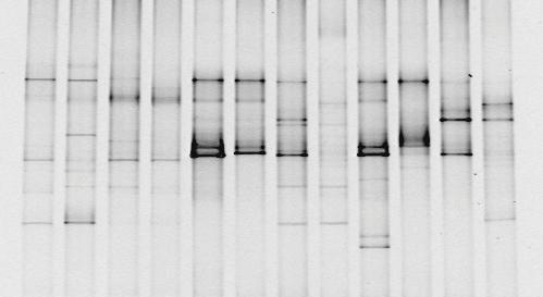
You've taken your sample, extracted the DNA, amplified the 16S rDNA in a PCR machine, run a DGGE gel and you end up with something like the picture below.
You can see that in some lanes there are more bands than others, some bands are darker than others.. it's a start, but it's not like you can publish that as a brilliant discovery. It's time to do some analysis! As we discussed earlier, analysing the "darkness" of the bands to quantify how much DNA is there isn't a reliable analysis. The DGGE profile is essentially a fingerprint of the microbial community, so we have to rely on comparing different fingerprints and deciding how different they are.
We can compare fingerprints objectively and decide that "Column A looks different to B, it's got 3 bands in different places. Also, it looks more similar to B than it does to C", but that's about it.
Quantifying the Qualitative
What we really need for convincing results is to quantify the differences. The first step is to change our DGGE profile into a matrix. Each column is a sample, and each row is where a band appears in at least one of the columns. If a band is present we assign the value 1 and if not it gets a 0.
 |
| Converting a DGGE profile to a Binary Matrix. |
Now that we've assigned numbers to everything, we can get a quantitative idea of "distance" between different samples. To do this, we can either use a
Jaccard index or
Dice's coefficient. I'm going to focus on the Jaccard index. The formula is:
J(A,B) = |A∩B| ÷ |A∪B|
If you love maths, feel free to read about
∩ and ∪ here. The plain English translation is:
Percentage similarity = (|Number of rows where both columns are 1| ÷ |Number of rows where at least one of the columns is 1|) x 100
If we compare A and B from the profile above, there are 4 different rows which have bands in both A and B and there are 6 different rows which have bands in either A or B. So our percentage similarity is:
(4 ÷ 6) x 100 = 66.67
A and B are 66.67% similar. If we compare every sample with every other, we can build a similarity matrix. The similarity matrix for the profile above is:
|
|
A |
B |
C |
D |
E |
|
A |
100 |
-- |
-- |
-- |
-- |
|
B |
66.67 |
100 |
-- |
-- |
-- |
|
C |
42.86 |
25.00 |
100 |
-- |
-- |
|
D |
16.67 |
33.33 |
14.29 |
100 |
-- |
|
E |
25.00 |
11.11 |
66.67 |
33.33 |
100 |
This similarity matrix is a way of quantifying how different each of the samples is to each of the others. We can see quite easily that B and E are the most different and that C and E / A and B are the most similar samples. The rest of the data gets lost in the table. We want to present it in a way that's going to be easy for someone to look at and instantly see the relationships between different samples.
UPGMA Trees
Now that we've got a similairty matrix, we can build a UPGMA tree.
The first step is to identify which of our samples are most similar. A and B have a similarity of 66.67%, and so do C and E. We can plot this on a graph as shown below:
The vertical lines are drawn at 66.6%. Now that AB and CE are joined together, we need to make a new similarity matrix to reflect this, starting with AB. We do this by averaging the similarities of A and B to all the other points as per the original similarity matrix. For example, in the original matrix A is 42.86% similar to C and B is 25% similar to C. Therefore the similarity between AB and C is (42.86 + 25)/2 or 33.93%.
|
|
AB |
C |
D |
E |
|
|
AB |
100 |
-- |
-- |
-- |
|
|
C |
33.93 |
100 |
-- |
-- |
|
|
D |
25 |
14.29 |
100 |
-- |
|
|
E |
18.06 |
66.67 |
33.33 |
100 |
|
Now that we've calculated the similarity between AB and the other samples, we can do the same for CE.
|
|
|
AB |
CE |
D |
|
|
|
AB |
100 |
-- |
-- |
|
|
|
CE |
26 |
100 |
-- |
|
|
|
D |
25 |
23.81 |
100 |
|
With our new similarity matrix, we look to see which points out of AB, CE and D are the closest together. AB and CE come out on top with 26% similarity. We can plot this on the graph:
Now AB and CE are joined together, so we need to make another similarity matrix to reflect this. Again, we'll need to re-calculate the similarity of ABCE to D by averaging the similarities of AB to D and CE to D which would be (25 + 23.81)/2.
|
|
|
ABCE |
D |
|
|
|
|
ABCE |
100 |
-- |
|
|
|
|
D |
24.405 |
100 |
|
|
We can plot out final lines on the graph, joining ABCE and D at 24.4% similarity to produce the finished UPGMA tree.

This gives us a visually easy way of interpreting the data. Straight away we can group our 5 samples into 3 families which are roughly equally different from each other: AB, CE and D.
Is band intensity a measure of bacterial abundance?
Yes and no, but probably more no than yes. It's possible to analyse the intensity of bands in a DGGE gel to get a semi-quantitative idea of the abundance of bacteria from the sample. This requires imaging software which compares the intensity of each band to the total intensity in the lane (the sum of all the intensities of all the bands in the lane).
What you're getting there is relative abundance so you can't conclude:
"Band X has an intensity value of 3, therefore there must have been 2.0x10⁶ Pasturella multocida in the sample"
but rather:
"Band X contributes 50% of the total band intensity, so roughly 50% of the bacteria in this sample contributed to Band X."
Of course, the waters are further muddied by the inconveniences that contribute to PCR biases like some bacteria having more than one copy of the 16S rRNA gene which may or may not all have the same sequence.
And then there's even more mud added when you consider some of the problems with DGGE like gel to gel variation. So at the end rather than a crystalline answer you've got something that looks decidedly murky.
In short:
Yes, you can use DGGE as a quantitative method BUT it's only semi-quantitative and why would you want to when you've got Next Generation Sequencing or quantitative PCR which are way better?
Some studies will list a Shannon index (discussed at the bottom of this blog). This analysis will be based on the intensity of the bands, since the Shannon index cannot work with the binary data that we used to draw a UPGMA tree. This is a valid analysis if you're comparing samples within your study, since all samples were analysed on the same gel and using the same software. However, remember it's not an absolute value so it can't be compared across studies, especially if it was calculated from a DGGE gel.


